Death Wish Coffee Core Packaging Architecture
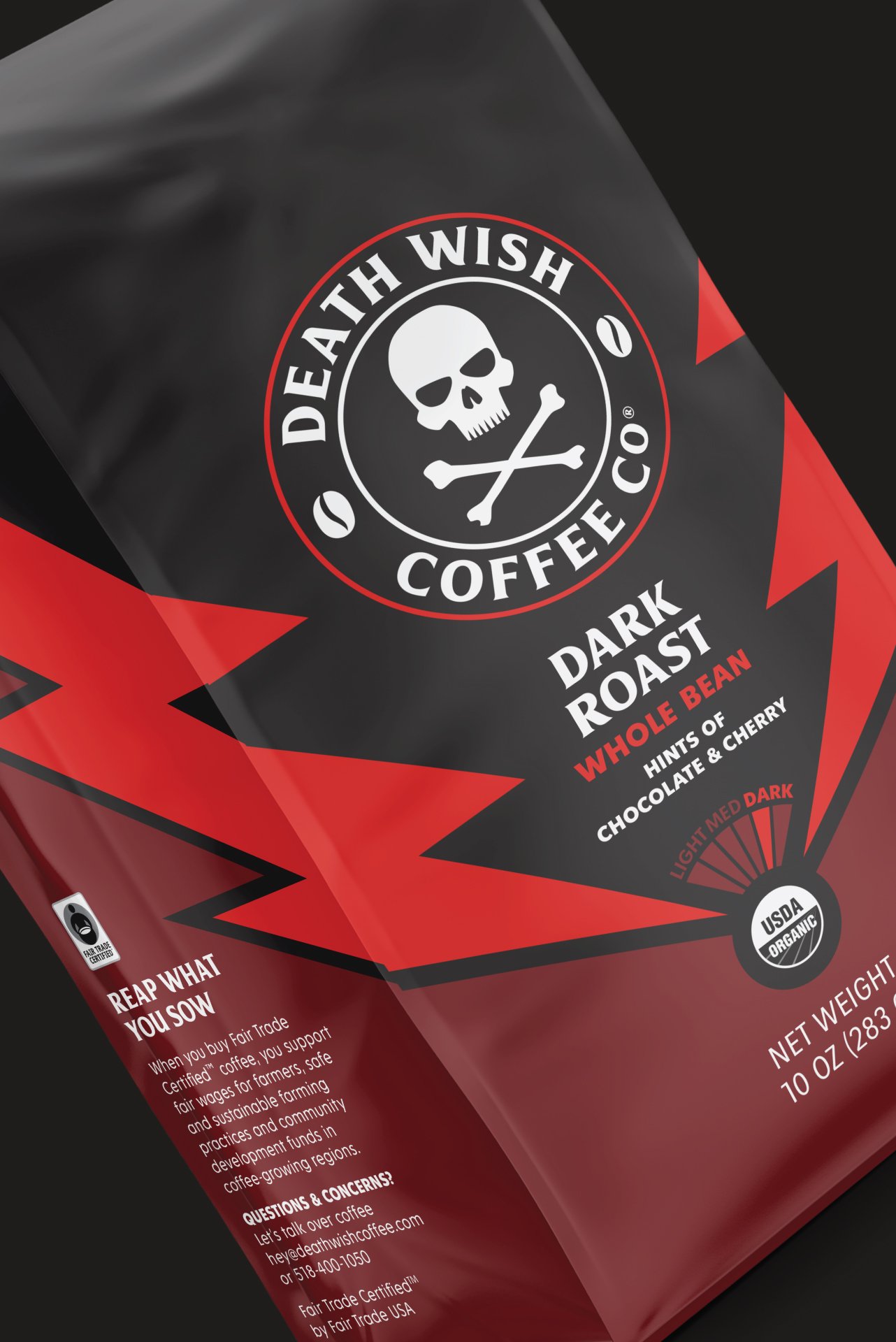
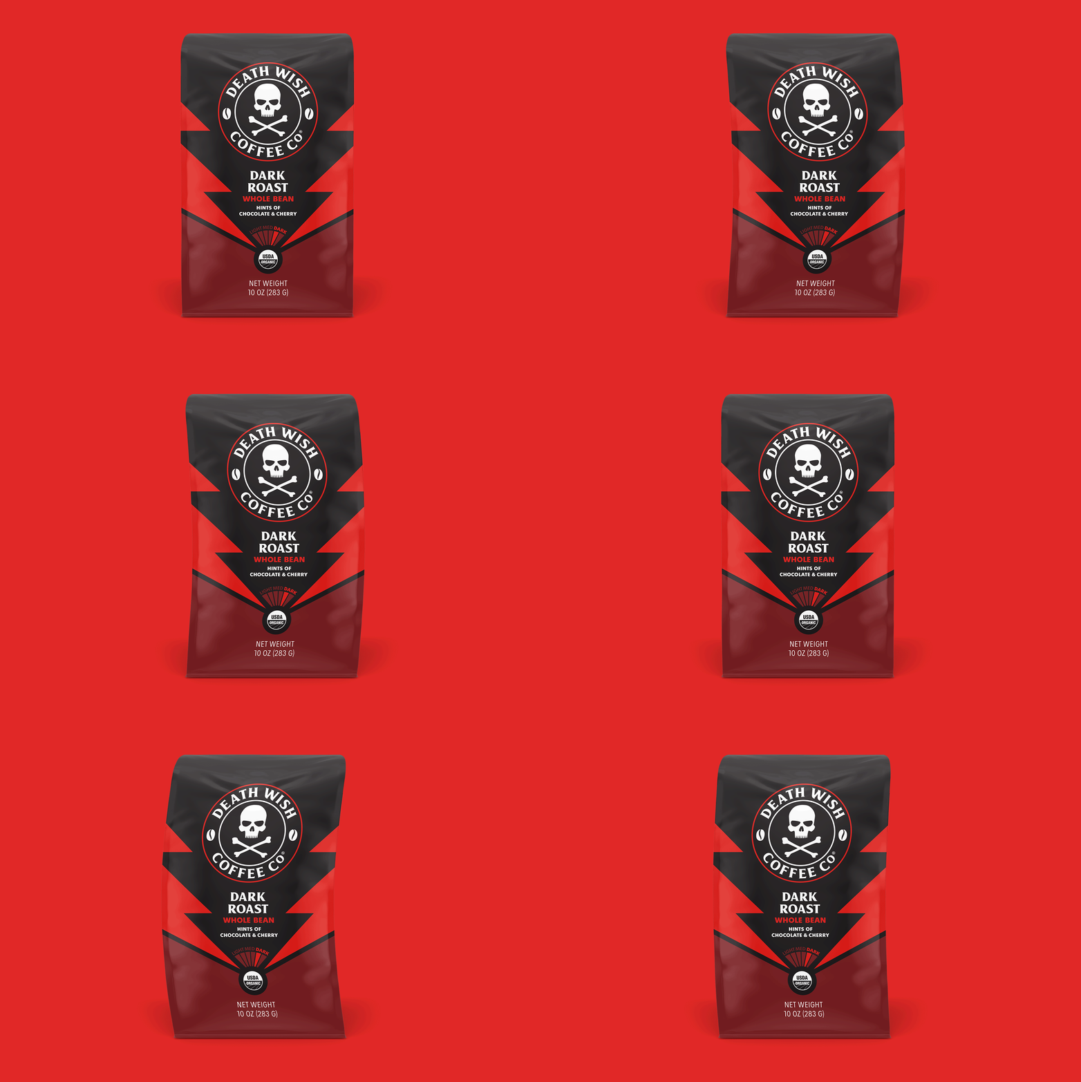
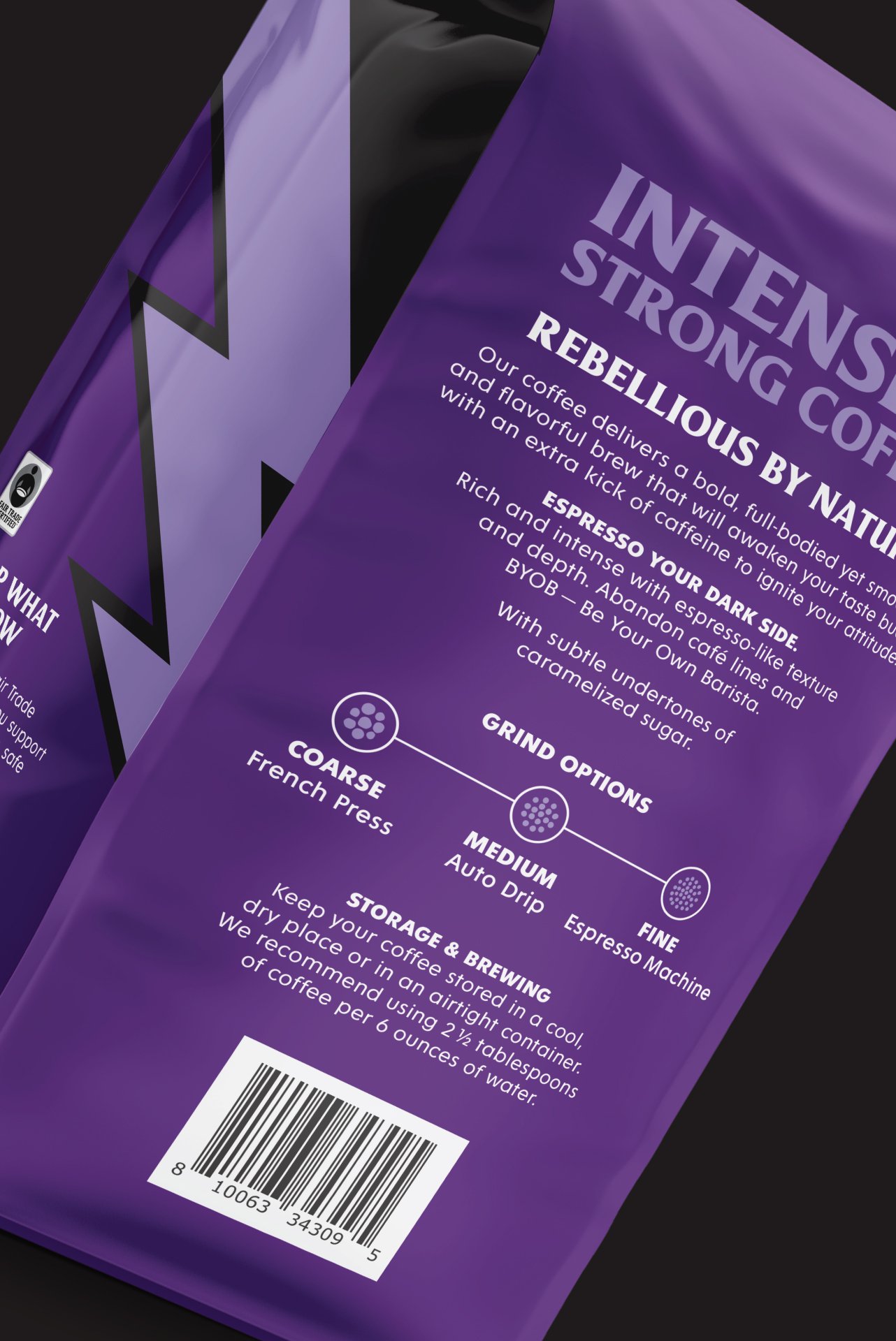
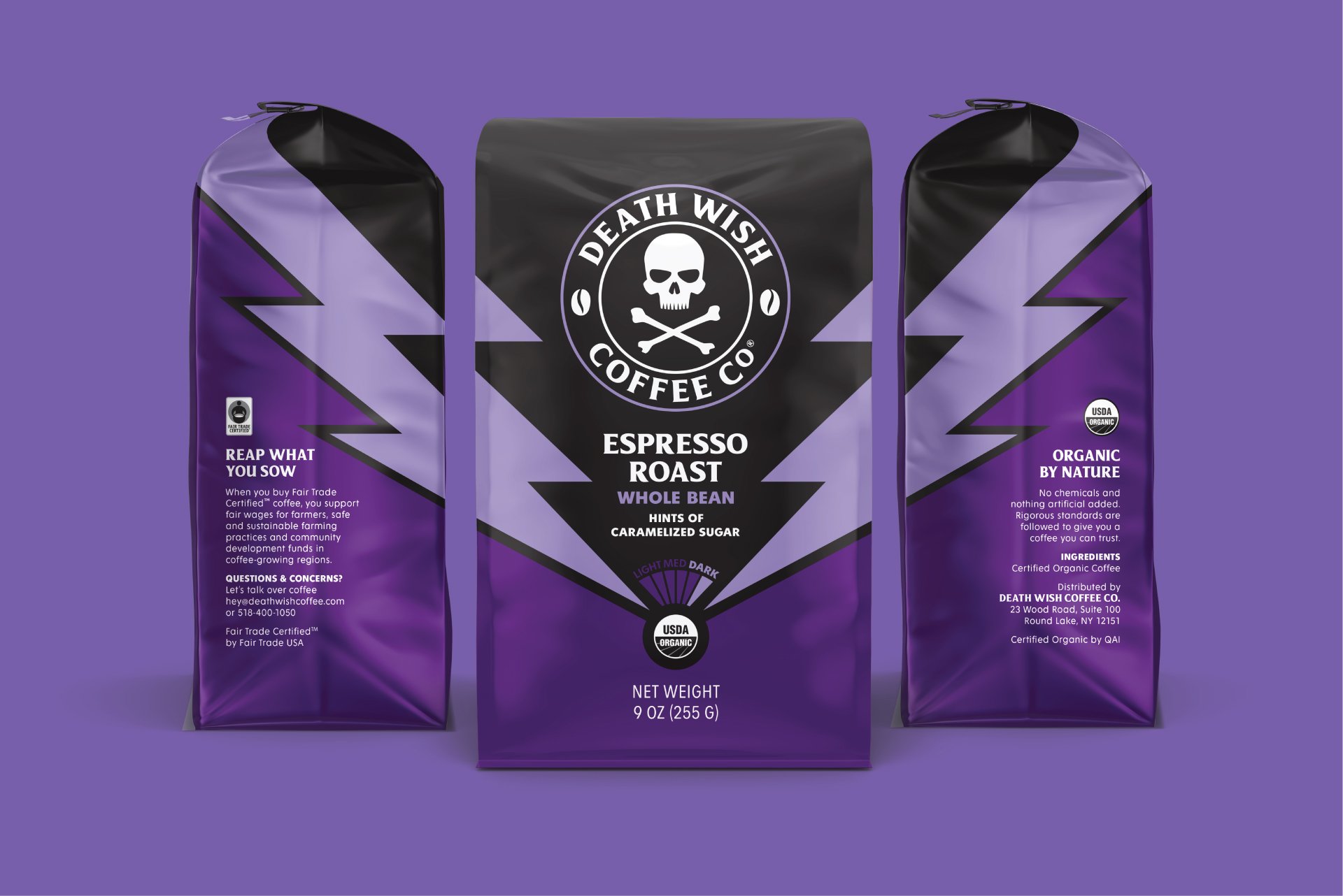
After nearly a decade in the market offering a single blend of coffee, coupled with ravenous retailers requesting more product on the shelves—DWC was challenged with creating a new, replicable packaging design that maintained its bold & rebellious identity while serving a growing lineup of core roasts. The goal was to maintain high awareness while the brand moved away from their original tagline previously defining the front of pack design. As the “The World’s Strongest Coffee” tagline came off the pack, it was imperative to introduce an illustrative element that reinforced the notion that this is high octane fuel for the human machine, without saying it. Que lighting bolts.
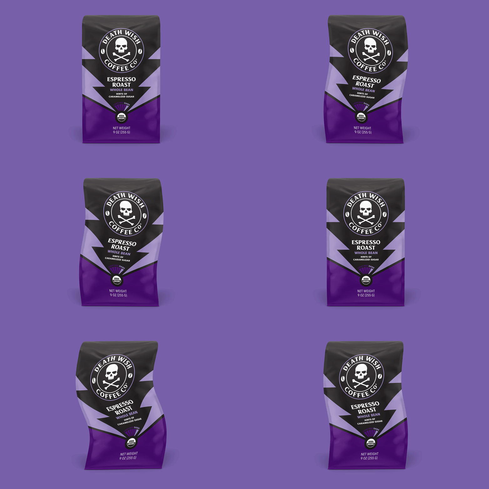
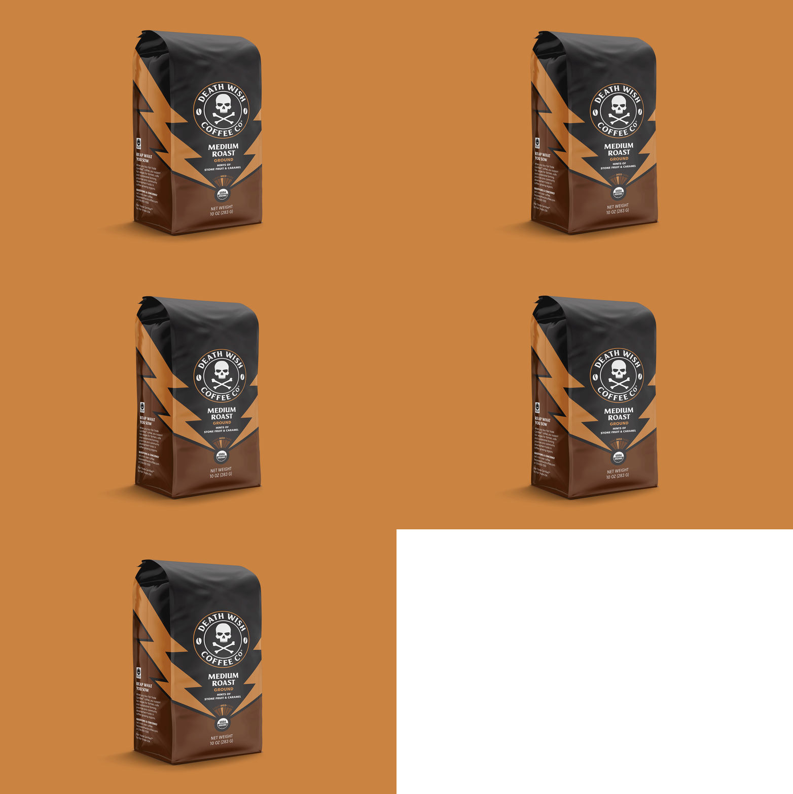
Using these new elements to frame the centralized design layout, legacy consumers were still able to recognize their favorite brand while creating a dynamic pack design set that demanded the attention of potential customers walking the aisles filled with packaging as flavorless as the coffee filling the bags.
Credits
Creative Director: Thomas Dragonette
Designer: Peter Witt
Copywriter: Audrey Kallenberger
